Case study
Lufthansa
Experience
About
Bringing a Corporate
Identity to New Life
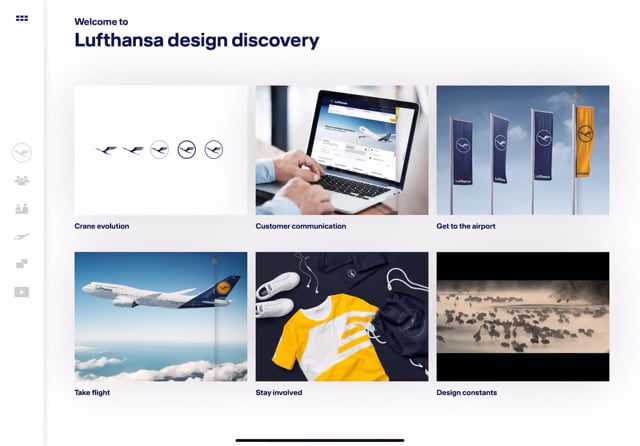
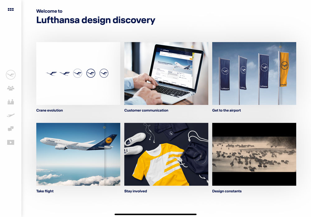
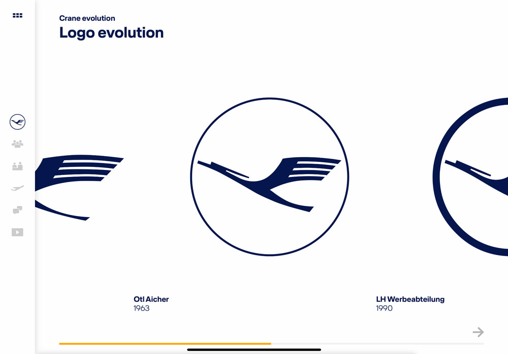
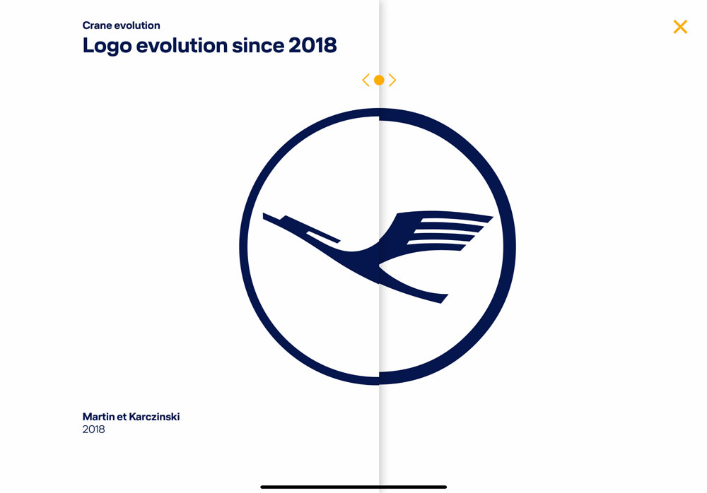
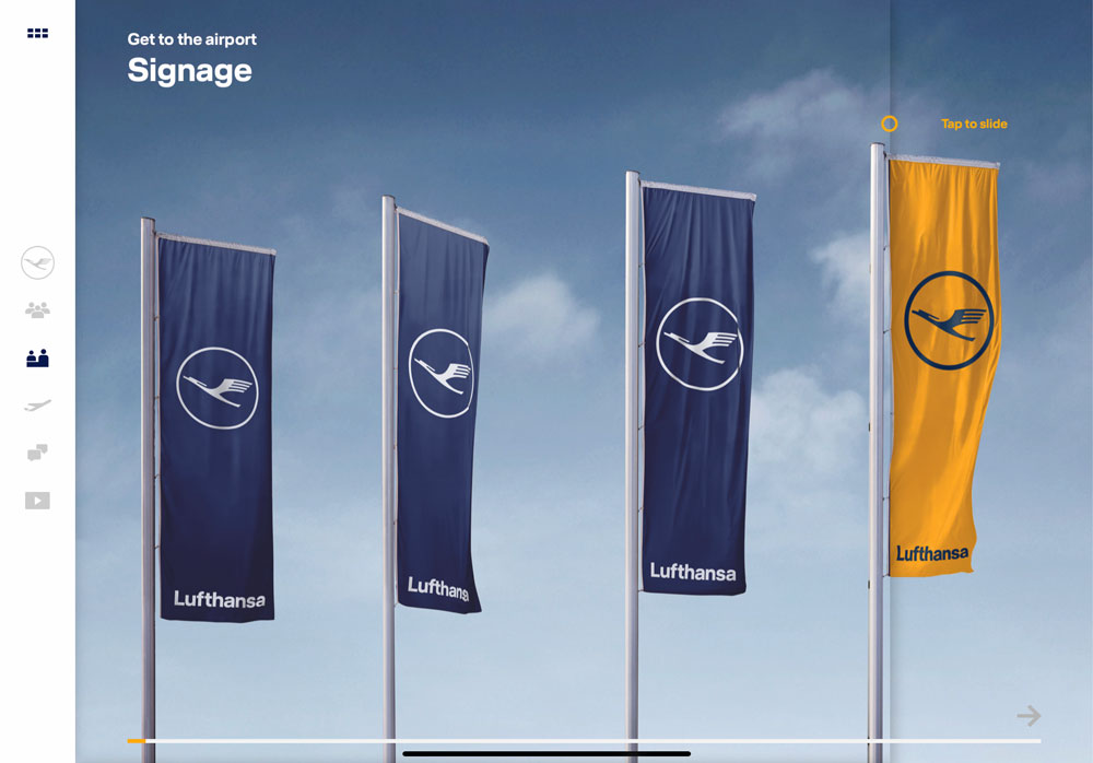
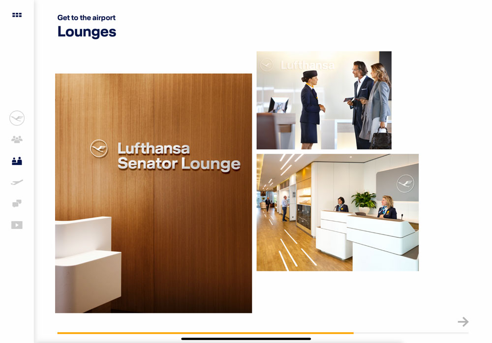
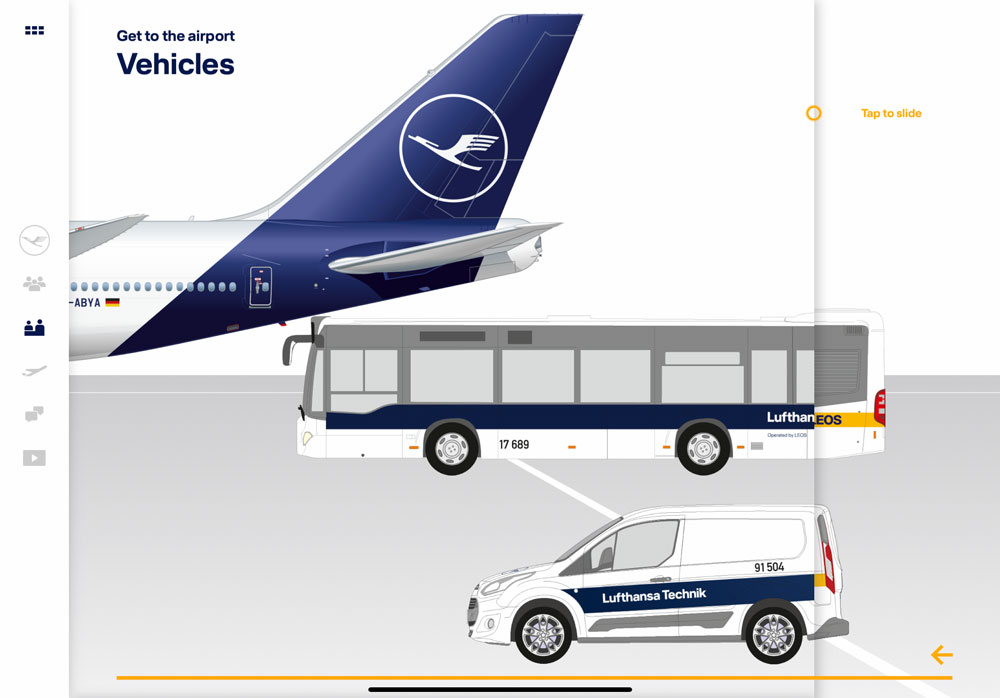
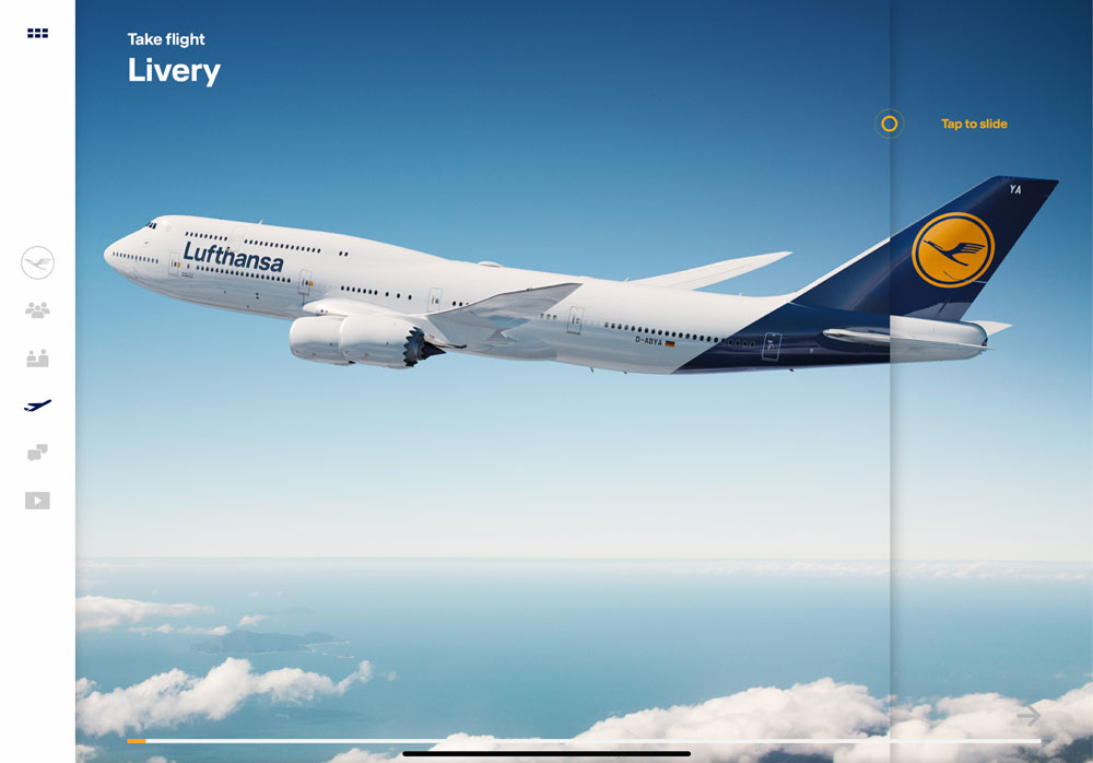
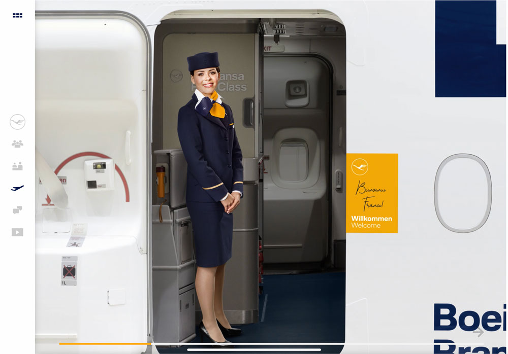
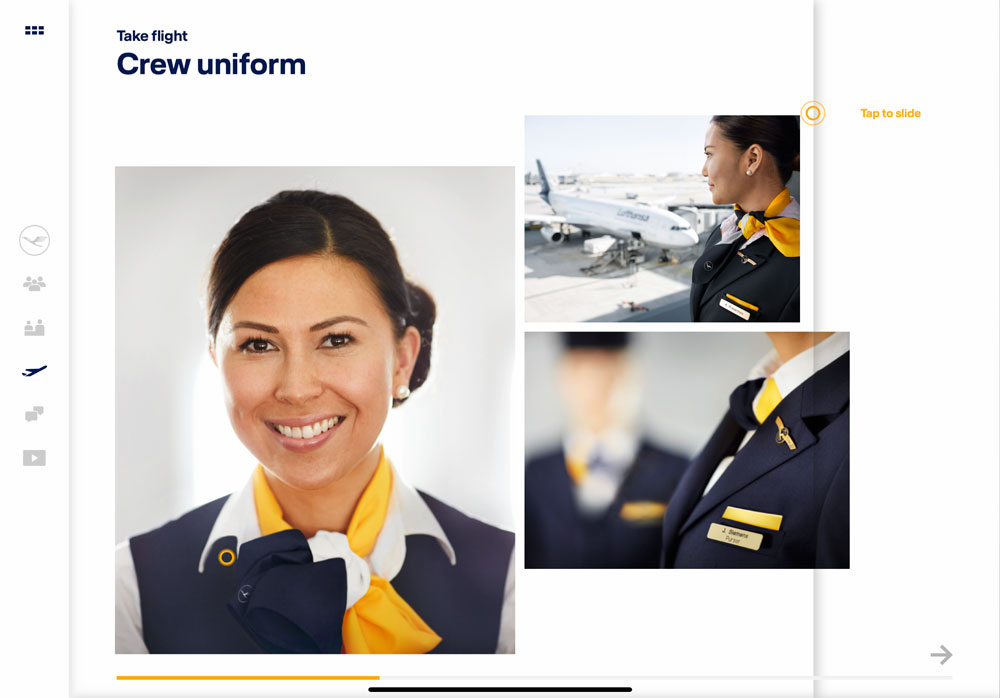
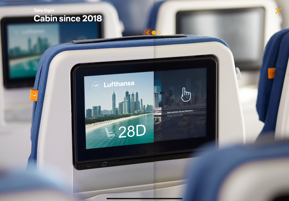
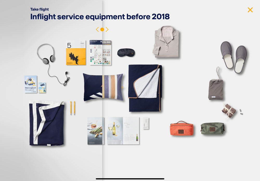
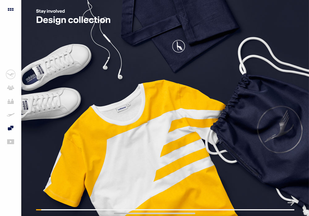
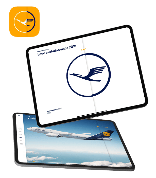
Bringing a new corporate identity to life – that was the driving impulse for this special project. At the beginning of 2018, Lufthansa introduced a new logo and corporate design as part of the rebranding and redesign of its corporate identity. With the Lufthansa Experience App for the iPad, employees can use and present the new design in meetings, projects and at trade fairs in order to create a deeper understanding of the Lufthansa brand and its rich history. Exclusively selected graphic content unfolds its full impact through individually coded animations and features. Thus, the app in its entirety stands for a special brand and knows how to tell its story without many words.
Conception
From a technical point of view, the Lufthansa Experience App was a unique project, as less classical functionalities were integrated, but the focus was primarily on user experience, design and compatibility on all devices. It was important to show an eye for detail to ultimately be able to create a comprehensive experience for the user. We call this pixel perfection – where complicated animations and effects were implemented in such a way that they fit into the overall design perfectly and work on different tablets without causing errors within the application. A very fast implementation of the first version was achieved in four weeks. This is a short time span for such a large project with only custom coding.
Process
The Lufthansa app was developed in collaboration with Martin et Karczinski, the developers of Lufthansa’s new corporate design. They are ranked one of the top agencies for corporate design and corporate identity in Germany. Due to the very close collaboration, we were aware of the high demands of our clients from the beginning. We created a customized, optimized UI which guides the user through a story to explore the new design. The development took place in close cooperation with our partners via a direct communication channel. During our sprints, there were constant feedback loops so that improvements could be implemented immediately. Clear and targeted communication was essential for the implementation of the desired features in order to combine design and technical functionality.
Result
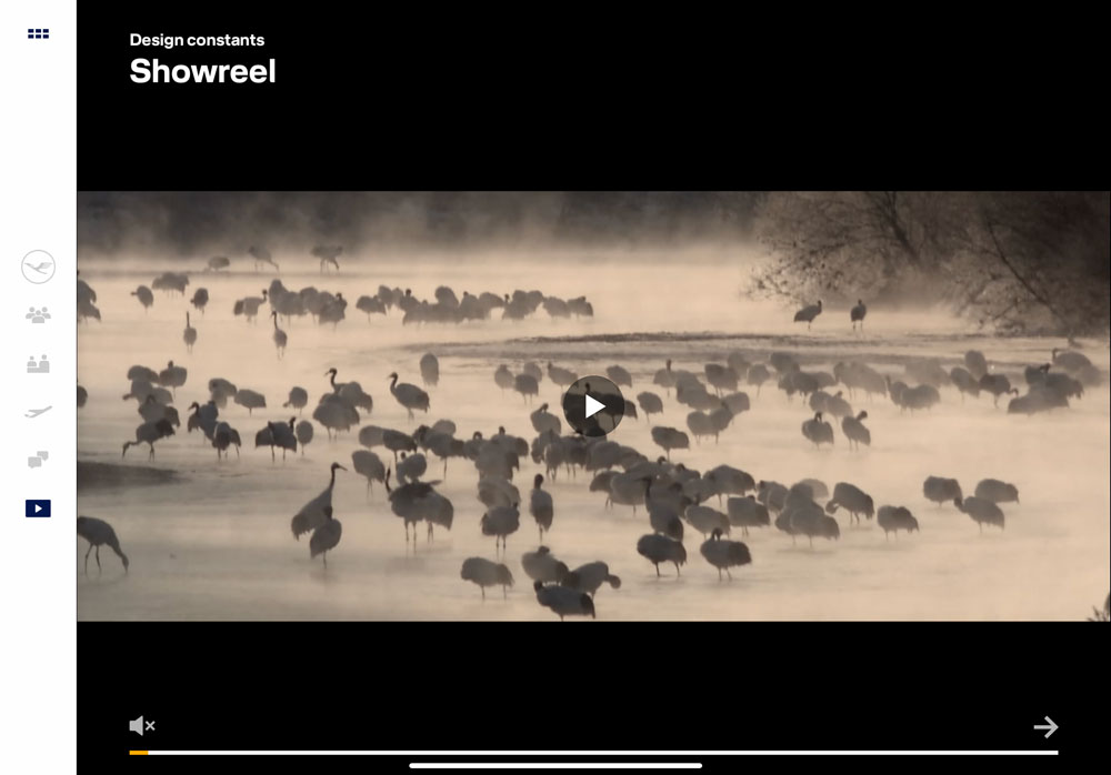
The final product brought Lufthansa’s visual redesign to life in beautiful, intuitive ways like interactive 3D-video integration or parallax-scrolling. The CI visualization includes a range of engaging animations that brings the new Lufthansa CI to life beyond the logo, allowing users to explore the new clothing and interior design of their airplanes. The app is now used proudly throughout the Lufthansa organization. We see it as a testament to the power of collaboration among great partners like Martin et Karczinski and Lufthansa.
iPadOS Experience
Future
In the future, the application will continue to strengthen the motivation of Lufthansa’s employees and promote identification with the brand. In addition, it has demonstrably established itself as a strong flagship for trade fairs and is loved by many aviation enthusiasts. After this intensive and effective collaboration and the satisfactory end product, we too are floating on cloud nine. QuickBird Studios will continue to provide maintenance services and the entire team looks forward to future projects with Lufthansa.

